What is Website Navigation?
Website navigation refers to the system or structure that allows users to move through the different pages and sections of a website. It plays a critical role in user experience (UX) and helps visitors easily find the content they’re looking for. Well-structured navigation is also essential for search engine optimization (SEO), as it enables search engines to crawl and index your pages more effectively.
A website with intuitive and efficient navigation increases the likelihood that users will spend more time exploring your content, which in turn, can lower bounce rates and improve overall user engagement.
What is a Website Navigation Menu?
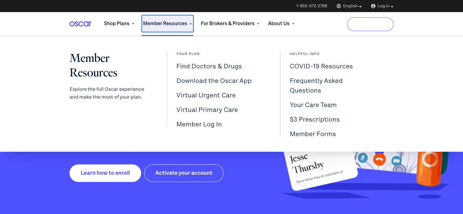
A website navigation menu is a collection of links, buttons, or icons that guide users to different sections or pages of the website. Typically found at the top of the page, navigation menus serve as a road map for visitors, helping them locate specific content or actions, such as contacting support, purchasing a product, or reading a blog post.
There are two main types of navigation menus:
- Primary Navigation: This menu includes the most important pages of a site, like the homepage, products, services, and contact information.
- Secondary Navigation: Often located in the footer or sidebars, secondary navigation helps users find less critical information, such as terms of service, privacy policies, or blog archives.
Different Types of Website Navigation
Horizontal Navigation
This is one of the most common types of website navigation, where menu items are arranged horizontally across the top of the page. It’s a straightforward design that works well for smaller websites or those with fewer categories.
Horizontal navigation is visually familiar to most users, making it a go-to option for user-friendly design.
Vertical Navigation
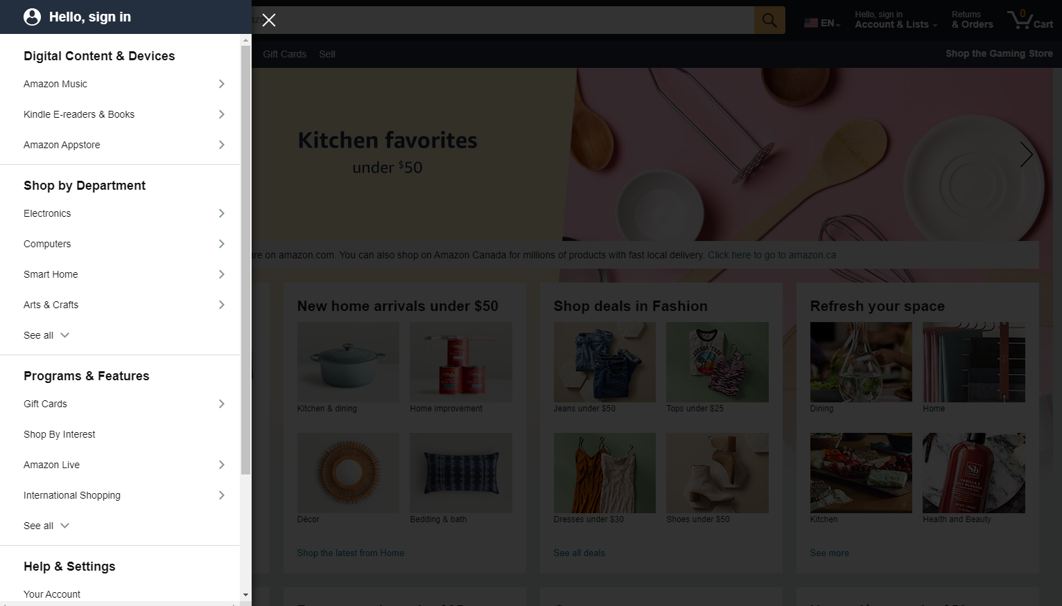
Vertical navigation menus display options in a list format along the side of the page. This design is effective for websites with numerous categories or subcategories, as it allows more room for multiple links.
Vertical navigation is commonly seen in e-commerce websites or sites with a complex architecture.
Breadcrumb Navigation
Breadcrumb navigation is a secondary navigation feature that shows users where they are within the website’s hierarchy.
It typically appears as a horizontal line of links near the top of the page, showing the path from the homepage to the current page. Breadcrumbs are particularly useful for large websites, as they give users a sense of orientation and make it easy to navigate back to previous sections.
Different Website Navigation Bar Designs
Fixed (Sticky) Navigation
Fixed or “sticky” navigation refers to menus that stay in place as the user scrolls down the page. This design is excellent for ensuring that key navigational elements remain accessible at all times, enhancing user experience and keeping critical actions, like “Contact Us” or “Shop Now,” always within reach.
This navigation bar design is particularly effective for websites with long, scroll-heavy pages, such as blogs or one-page websites. It is also widely used in mobile-friendly designs where users expect quick, uninterrupted access to navigation elements.
Collapsible/Hidden Navigation (Hamburger Menu)
The hamburger menu is a popular choice for mobile websites and responsive designs. It consists of a small icon (typically three horizontal lines) that expands into a menu when clicked. This helps to save screen space while still offering full navigation functionality. However, this design has some drawbacks, as users might not immediately recognize the icon or forget that it contains more options.
Despite these potential issues, hamburger menus are highly practical for mobile users and can also be used in minimalist desktop designs. When implementing this navigation style, it’s crucial to ensure that the icon is easily recognizable and intuitive.
Footer Navigation
Footer navigation is often overlooked but is a powerful tool for website navigation. This section at the bottom of a webpage typically includes links to secondary pages, such as the privacy policy, terms of service, or customer support. It serves as a backup navigation system for users who reach the bottom of the page and still need further directions.
While the footer may not house critical links, its role in providing easy access to important secondary information ensures a better overall user experience. Additionally, it is an excellent place to include internal links for SEO purposes, improving crawlability.
Examples of Website Navigation
Let’s take a look at some real-world examples of effective website navigation. Each of these websites showcases different navigation strategies that enhance usability and offer inspiration for your own designs:
Apple – Apple’s website features a clean horizontal navigation bar with clear, concise labels that guide users to the most important areas, such as Mac, iPhone, and iPad. Their use of mega menus for detailed product categories ensures a smooth browsing experience.

Amazon – Amazon uses a vertical navigation menu, with dropdowns offering quick access to various product categories. The navigation is highly organized, enabling users to locate items easily, even in a massive catalog.

Zara – Zara’s navigation design stands out with its minimalist approach. Their use of a collapsible hamburger menu on both desktop and mobile platforms keeps the design sleek while still allowing users to access multiple product categories.

The New York Times – The New York Times incorporates a mix of horizontal navigation for main sections (like News, Opinion, and Sports) and a secondary dropdown menu for subsections. Their use of breadcrumb navigation makes it easy for readers to explore different news categories.

Nike – Nike’s website navigation focuses on a large, prominent horizontal menu with dropdown options. The navigation is user-friendly, with clear category labels that guide users through various products and collections.

Website Navigation Best Practices
Keep It Simple
One of the golden rules of website navigation is to keep it simple. Overcomplicating your navigation with too many options, submenus, or unnecessary features can overwhelm users and make it difficult for them to find what they need.
A clean, streamlined menu will help users focus on the most important areas of your website and provide a more enjoyable user experience.
From an SEO perspective, simpler navigation is also beneficial. Search engines prefer websites with clear structures and logical hierarchies, as this makes it easier for them to crawl and index your pages. A simple navigation layout also encourages users to spend more time exploring your site, potentially boosting your ranking.
Make It Mobile-Friendly
With the increasing number of users accessing websites via mobile devices, having a mobile-friendly navigation system is no longer optional—it’s a necessity. Responsive website design ensures that your navigation menus adjust to different screen sizes, allowing for an optimal user experience regardless of the device.
Mobile-friendly navigation often involves collapsible menus, such as the hamburger menu, or vertical navigation that adapts seamlessly to smaller screens. Ensuring that buttons and links are large enough to be easily tapped with a finger is another key mobile-friendly design consideration.
Use Clear Labels
Descriptive, clear labels are essential for effective website navigation. Labels should be self-explanatory, using simple language that accurately reflects the content of the linked page. Vague or overly creative labels can confuse users and lead to higher bounce rates as visitors struggle to find what they need.
Clear labels also have SEO benefits. Search engines use the text in your navigation links to understand what each page is about. By using descriptive keywords in your labels, you can improve the chances of ranking for relevant search queries.
Include a Search Bar
Adding a search bar to your website’s navigation can significantly improve usability, especially for larger websites with extensive content. A well-placed search bar allows users to quickly find what they’re looking for without having to click through multiple categories or menus.
It serves as a safety net for users who may not immediately find their desired content through your main navigation.
When adding a search bar, ensure it’s prominent and easy to use. It’s best placed in the top right corner or at the center of your header, where users typically expect it. For an even more optimized experience, implement predictive search features that suggest relevant results as users type.
Conclusion
Website navigation plays a pivotal role in shaping the overall user experience and improving your site’s search engine rankings. Whether you’re creating a simple blog or managing a complex e-commerce site, it’s essential to focus on intuitive, mobile-friendly, and well-labeled navigation designs.
By following the best practices outlined in this post, you can ensure that visitors to your site have a smooth and enjoyable journey while also boosting your SEO performance.
From understanding different navigation types to studying real-world examples, crafting a user-centered navigation structure is key to your website’s success. Keep it simple, responsive, and organized, and you’ll not only enhance user satisfaction but also achieve better engagement and conversions.
FAQs
1. What is website navigation?
Website navigation is the system that allows users to move between different pages or sections on a website. It includes elements like menus, buttons, and links that help users find the content they’re looking for.
2. Why is website navigation important for SEO?
Good website navigation improves SEO by making it easier for search engines to crawl and index your site. Clear navigation structures help search engines understand the hierarchy of your content, which can positively impact your rankings.
3. What is the best type of website navigation for e-commerce websites?
E-commerce websites typically benefit from vertical navigation or mega menus, which allow users to easily access a wide range of product categories and subcategories. Adding breadcrumb navigation can also enhance user experience on large e-commerce sites.
4. How can I make my website navigation mobile-friendly?
To make navigation mobile-friendly, implement responsive design techniques, such as collapsible menus (like the hamburger menu) and larger clickable areas for touch screens. Ensure your navigation adjusts seamlessly to different screen sizes.
5. What is the difference between primary and secondary navigation?
Primary navigation contains links to the most important sections of your website, such as the homepage, products, or services. Secondary navigation, often found in footers or sidebars, includes links to less critical pages like terms of service, privacy policies, or archived content.
Here’s to your success!


